The logo for Niranta is more than just a symbol; it is a carefully crafted representation of our values, our vision, and the essence of what Niranta stands for. Every element of the logo, from the typography to the stylistic details, has been thoughtfully designed to tell the story of Niranta—a story of continuity, connection, and the endless pursuit of peace and tranquility. Let’s dive into the significance of each aspect of the Niranta logo and how it ties into the story of our farmhouse and its slogan, “42, Our Life’s Answer.”
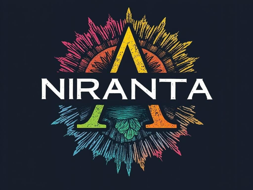
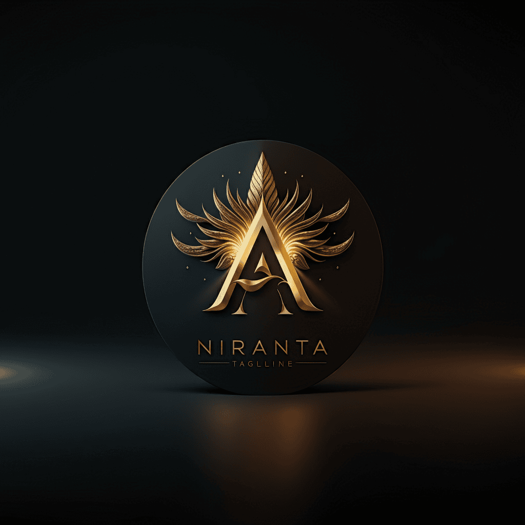
List of logos we looked at. Most of them are AI generated.
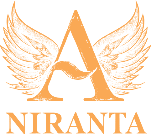
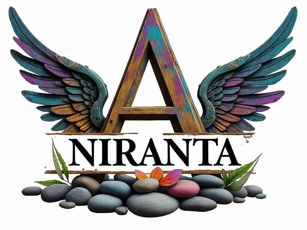
We finally chose this logo for Niranta. It perfectly captures the essence we were looking for in a logo - it's a blend of strength, tradition, and freedom. The bold typography reflects the timeless and enduring nature of Niranta, while wings symbolize growth, aspiration and our deep connection to nature.
Typography: Bold and Timeless
Typography: Bold and Timeless
The typography of the Niranta logo is simple yet bold, reflecting the timeless nature of our farmhouse. The serif font used for "NIRANTA" carries an air of tradition and elegance, symbolizing the deep cultural roots that our farmhouse embodies. The clean lines and strong presence of the text convey a sense of stability and permanence, much like the foundation of our home.
The central letter “A,” which stands out prominently in the logo, is particularly significant. This "A" not only represents the letter in the name Niranta but also serves as a nod to Amit, Nitin’s brother, who holds a special place in our hearts. The emphasis on this letter symbolizes the central role of family in our lives and in the creation of Niranta.
Stylistic Elements: Wings of Freedom and Serenity
Stylistic Elements: Wings of Freedom and Serenity
One of the most striking features of the Niranta logo is the set of wings that flank the letter “A.” These wings are not merely decorative; they are rich with symbolism. Wings traditionally represent freedom, growth, and aspiration—all qualities that are deeply woven into the fabric of Niranta. The wings suggest a connection to nature, hinting at the open, airy spaces and the harmonious relationship with the environment that Niranta embodies.
The detailed, feathered design of the wings adds a layer of elegance and sophistication, illustrating the care and precision that have gone into every aspect of the farmhouse’s design. The wings also evoke a sense of movement and dynamism, representing the continuous journey of growth, learning, and discovery that Niranta stands for.
The Story Behind the Name and Slogan
The Story Behind the Name and Slogan
The name “Niranta” itself is a fusion of the letters from our family members’ names—Nitin, Rashmi, Nia, and Rishab—with the “A” representing Amit. This blend of letters signifies the unity and continuity of our family, and the name carries the meaning of something eternal or unending in Sanskrit. Just as the name suggests an ongoing journey, the wings in the logo symbolize the boundless possibilities and the infinite love that we envision within the walls of Niranta.
The slogan “42, Our Life’s Answer” adds another layer of meaning to the logo. Inspired by The Hitchhiker’s Guide to the Galaxy, where 42 is humorously presented as the answer to the ultimate question of life, the universe, and everything, the slogan reflects our belief that life’s answers can be found in simplicity, love, and connection. The wings in the logo align with this philosophy, symbolizing the search for meaning and the freedom to explore life’s endless possibilities.
The Details: Harmony in Design
The Details: Harmony in Design
The Niranta logo is designed with a balanced color palette, using earthy tones that resonate with the natural environment that surrounds the farmhouse. These colors are calming and grounded, much like the atmosphere we’ve created in Niranta. The textures and gradients in the wings add depth, creating a sense of dimension that mirrors the layers of meaning embedded in the farmhouse’s design.
The composition of the logo is both symmetrical and harmonious, reflecting the balance and order that we’ve strived to achieve in Niranta. Whether it’s the careful alignment of the text or the proportionality of the wings, every element is meticulously placed to create a cohesive and visually pleasing design.
Conclusion: A Logo That Tells a Story
Conclusion: A Logo That Tells a Story
The Niranta logo is more than just a visual identifier—it is a symbol of our journey, our values, and the home we’ve built with love and intention. The bold typography speaks to the strength and timelessness of our vision, while the wings evoke a sense of freedom, growth, and connection to nature. Together, these elements create a logo that not only represents Niranta but also tells the story of who we are as a family and what this farmhouse means to us.
As we continue to build and grow with Niranta, this logo will remain a constant reminder of the principles and the love that have guided us on this journey—a journey that, like the wings of our logo, is open, boundless, and full of endless possibilities.